By Mary McCartney
Enter any bookstore, and you are sure to find a wall of novels with typographic cover art. Typography and design play a key role in twenty-first century book marketing—to the point that some media outlets argue modern book design is becoming monotonous. What has prompted this focus on typography? Is it simply a marketing ploy? Franco Moretti has conducted extensive research on the evolution of novel titles. In the article “Style, Inc. Reflections on Seven Thousand Titles (British Novels, 1740-1850),” he argues that titles became increasingly similar to each other by the mid-nineteenth century. He further states, “The title is where the novel as language meets the novel as commodity, and their encounter can be extremely illuminating” (135). Indeed, by analyzing various editions of Jane Eyre by Charlotte Brontë, I suggest the same sentiment can be applied to cover art. Cover art is designed to attract readers, but it also functions as a visual representation of the novel.
There are countless publishers and editions of Jane Eyre—each edition with a unique cover. While I will not, and cannot, discuss the entirety of the cover art in a single blog post, I will examine a specific subset of this data. This post explores the evolution of Jane Eyre cover art from thirteen Penguin Books editions between 1966 and 2020. In the span of roughly 50 years, the cover art transforms from portraiture sourced from existing art (used to introduce the book’s themes and approximate Jane’s appearance) to bold typography.
Design decisions are complex; they are determined by marketing, industry trends, editorial prerogatives, as well as by the interests of readers. While many scholars have studied the ways in which cover art affects purchasing habits, this post instead explores the connection between cover art and the reception of the novel. My argument is twofold: First, I contend that the portraits representing Jane (seen in the first section) highlight her limited mobility and agency. These portraits are in various settings, but they all feature an immobile woman. My second argument traces the evolution from portraiture to typography. This shift, I suggest, parallels a change in the reception of the novel from the late twentieth to the early twenty-first century.
Representations of Jane

Out of the thirteen total covers in my data set, nine feature portraits meant to represent Jane. I would like to initially examine the first six editions of the novel, as they are more traditional portraits. From 1966 to 2006, Penguin exclusively features a portrait on the cover (Figure 1). Notably, Jane is not standing in one of these images, prompting the viewer to think about the opening line of the novel: “There was no possibility of taking a walk that day” (Brontë 9). When Jane is punished by Mrs. Reed for defending herself against John, she is told, “There, sit down, and think over your wickedness” (Brontë 15). At Lowood, Jane is directed to “sit in a quiet corner of the schoolroom” and sew (Brontë 63). Likewise, she “sits in the shade” (i.e., a shadowy area of the drawing-room) at Thornfield Hall while Rochester hosts Miss Ingram and his guests (Brontë 202). Thus, when she is sitting, Jane is punished, cast aside, or ignored. It is significant, then, that the cover art shows Jane sedentary. She is not going anywhere; she is enduring her circumstances.

Moreover, in these portraits, Jane is most often looking away from the viewer. In the 2003 edition, for example, Jane is looking at neither the book nor the child in her lap (Figure 2). Recall that Jane notices Helen Burns avoiding eye contact while Helen is punished at Lowood and assumes she is daydreaming. She notes, “Her eyes are fixed on the floor, but I am sure they do not see it—her sight seems turned in, gone down into her heart” (62). I suggest that we can read Jane’s lack of eye contact in the 1985, 1994, 1996, 2003, and 2006 editions in a similar manner. Jane is looking elsewhere, implying that her mind is not focused on her current surroundings.
These portraits of Jane also place her in domestic settings. For instance, in the 1966 and 1994 editions, Jane is represented by a woman sewing—a task she was often assigned at Lowood and presumably at Thornfield Hall. The 2003 edition features representations of Jane, Adele, and Miss Ingram. Miss Ingram and Adele are both standing in this image, signaling their mobility and opportunities to advance in society. In contrast, Jane is sitting and tending to Adele, and she is looking away from her companions and the viewer. These portraits all generally focus on Jane’s isolation.
From Portraiture to Typography
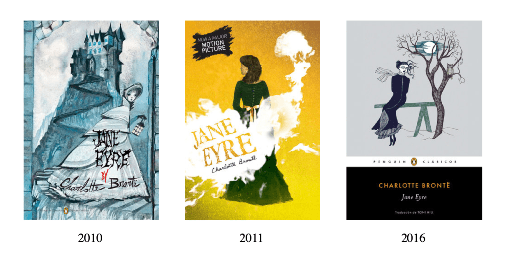
A noticeable shift occurs in 2009 in the Penguin editions: the cover art evolves from portraiture to typography and illustration. There is admittedly a marketing factor at play (i.e., some of these covers exist within a series of classic texts and the 2011 edition promotes the movie adaptation that came out that same year). However, this change in cover art also reveals a shift in the way publishers and readers perceive Brontë’s story. For instance, since 2010, there have been three representations of Jane on the cover (Figure 3). No longer is Jane imagined as occupying domestic space. In the 2010 and 2016 editions, Jane is outside[1]. In this sense, modern marketers give Jane more mobility, as do many modern readers who see Jane as an early feminist.
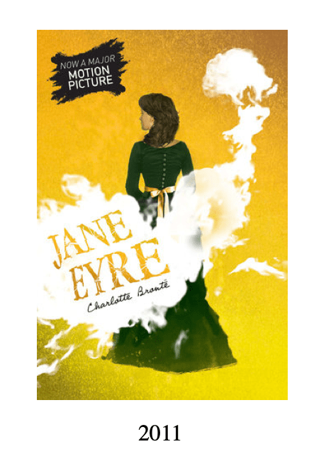
In addition, these representations are decidedly more Gothic than the portraits examined in the first section of this post, indicating a shift from classifying Jane Eyre as a domestic or romance novel to a Gothic novel. The fog and the fact that viewers cannot see Jane’s face in the 2011 edition hint at the mysterious nature of the tale (Figure 4). Readers cannot see Jane clearly; there is more occurring than meets the eye. The 2010 and 2016 editions include Tim Burton-esque illustrations—an uncanny style that would surely be recognized by readers. In addition, the 2010 publication shows Jane in a subterranean space below Thornfield Hall, which is depicted as both home and castle. Fred Botting contends, “[In Gothic literature] the castle gradually gave way to the old house: as both building and family line, it became the site where fears and anxieties returned in the present” (3). Botting’s assertion is certainly displayed in the novel.Yet, visually, a castle elicits Gothic themes more than an old manor. Jane is in motion, as if hurrying away from Thornfield Hall. The lantern in her hand suggests that it is dark outside. Similarly, the 2016 edition has Jane sitting in the woods at night. These covers ask viewers to consider what is lurking in the shadows—a tactic often employed by modern media with the resurgence of Gothic films and television shows. These covers, then, make Jane Eyre resonant to modern sensibilities.
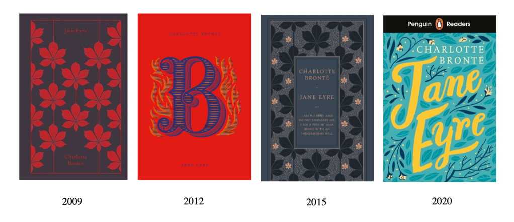
Aside from these three covers, modern cover art for Jane Eyre is typographic, revealing Jane’s move from a woman in a household to a household name (Figure 5). A text-only approach implies that the title or reputation of the novel is enough to draw reader interest. Discussing the length of novel titles, Moretti contends, “As the number of new novels kept increasing, each of them had inevitably a much smaller window of visibility on the market, and it became vital for a title to catch quickly and effectively the eye of the public” (139). Indeed, we see a shift from images back to text. The title of the novel once more carries the weight.
The background art of these text-only editions (i.e., the 2009, 2012, 2015, and 2020 publications) is worth noting. Three of these four editions include floral backgrounds. While this may be partially related to the style of Penguin’s graphic designers, it is notable that the pattern privileges the natural world over the domestic sphere—once again indicating that modern publishers give Jane agency. Furthermore, the 2015 edition includes a quote underneath the title: “I am no bird; and no net ensnares me; I am a free human being with an independent will.” The publishers decided that this quote represents the novel—a stark contrast to the cover featuring a representation of Jane with Adele and Miss Ingram.
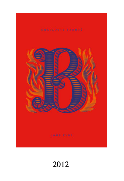
To close, I would like to examine the 2012 edition of the novel (Figure 6). This edition is part of the Penguin Drop Caps series—a series consisting of 26 novels, each representing a different letter of the alphabet. The description of this edition on Penguin’s website states, “‘B’ is for Brontë.” However, “B” also appears to stand for Bertha, especially considering it is paired with an illustration of flames. Bertha famously sets Rochester’s bed on fire in a scene where “tongues of flame darted round the bed” (Brontë 174). Bertha later burns Thornfield Hall to the ground. Considering early editions of the novel focus on domesticity, this choice of cover art is radical. The flames indicate that Brontë’s tale is more than Jane’s story. Modern readers and publishers are hearing marginalized voices, such as that of Bertha, who has been locked away by her husband.
Conclusion
Moretti asks, “How can a couple of words stand in for hundreds of pages? What does it mean, that they should do so?” (145). This post has explored a similar question: How can one image (or lack thereof) represent an entire novel? Moretti details the popularity of female first names as titles in eighteenth-century novels, thus suggesting the protagonist is in want of a surname. He proposes that a last name in a title, such as Jane Eyre, suggests “the marriage plot [was] becoming embedded within genres like the bildungsroman” (147). As this post has detailed, modern readers are interested in more than Jane’s marriage; they are intrigued by the bildungsroman and beyond.
In summary, cover designs indicate what thematic threads in a novel resonate with editors and designers, and thus, presumably, with readers. Closely examining the evolution of Jane Eyre cover art between 1966 and 2020 indicates that publishers’ and readers’ understanding of the novel is expanding. We see covers focusing on Jane in domestic spaces transform into covers where Jane is outdoors or absent entirely. Accordingly, one can infer that modern publishers and readers focus on aspects of the story beyond Jane’s function as a governess or an object of Rochester’s affection; they give Jane more agency and mobility. Indeed, in the typographic covers, Jane has walked off the page entirely.
Works Cited
Botting, Fred. Gothic. Routledge, 1996.
Brontë, Charlotte. Jane Eyre. Penguin Classics, 2006.
Moretti, Franco. “Style, Inc. Reflections on Seven Thousand Titles (British Novels, 1740–1850).” Critical Inquiry, vol. 36, no. 1, 2009, pp. 134–158.
[1] Unlike the outdoor cover from 1996, Jane does not appear to be at Thornfield Hall, thus signaling her independence.
